Florida Prepaid Rebrand
St. John > Branding
Description:
Florida Prepaid has helped millions of families save for college and after 30 successful years, the client was ready for a rebrand with one of the main concerns being loosing recognizability. The long standing logo had a few issues that the team needed to fix during the process. My approach was simple and effective and keeping the client’s concerns my priority was at the top of the list.
![]()
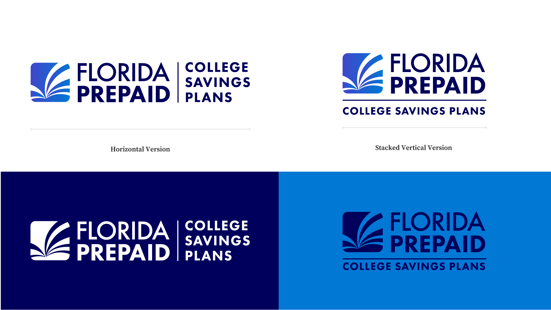
Before
![]()
Fixing the key areas of the existing logo was the key to understanding where to start. The icon displays an open book which identifies the brand with the importance of higher education. However, it is hard to identify the the logo mark as a book until it is stated as so. The next area of attention is the logo typography. The kerning is exaggerated and makes the words hard to read as each character stands on it’s own. Fixing this was important to fix accessibility issues that existed with the brand. The color palette was the other point of concern since the combination was making the brand feel dated and tired.
After
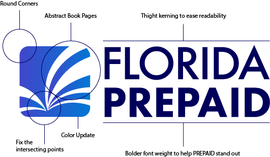
My approach was to keep it simple and problem solve for the current points that were affecting the logo to be functional. Rounding the corners immediately helped make the logo feel more friendly and modern. The book icon didn’t immediately look like a book so playing with the idea of abstracting it helped give the brand a little lift without departing completly from it. This not only made the client happy but also kept the recognizable feature the brand built for 30 yrs with a small modern touch. Finally, fixing the logo type helped the key words stand out while making it easier to read.

![]()
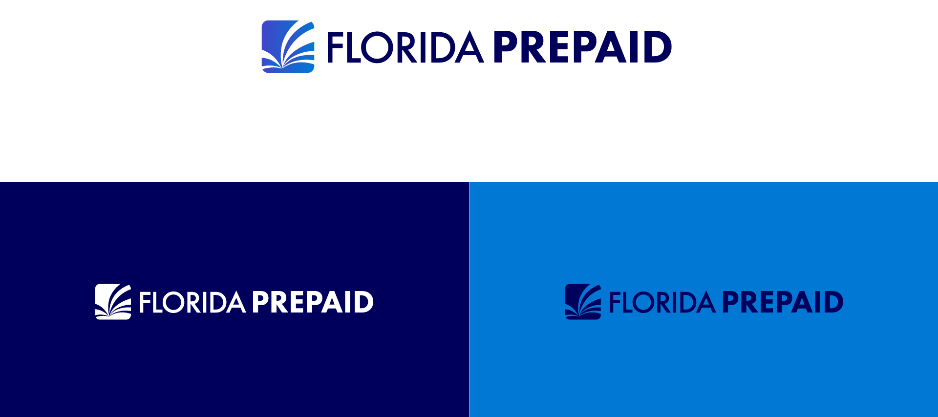
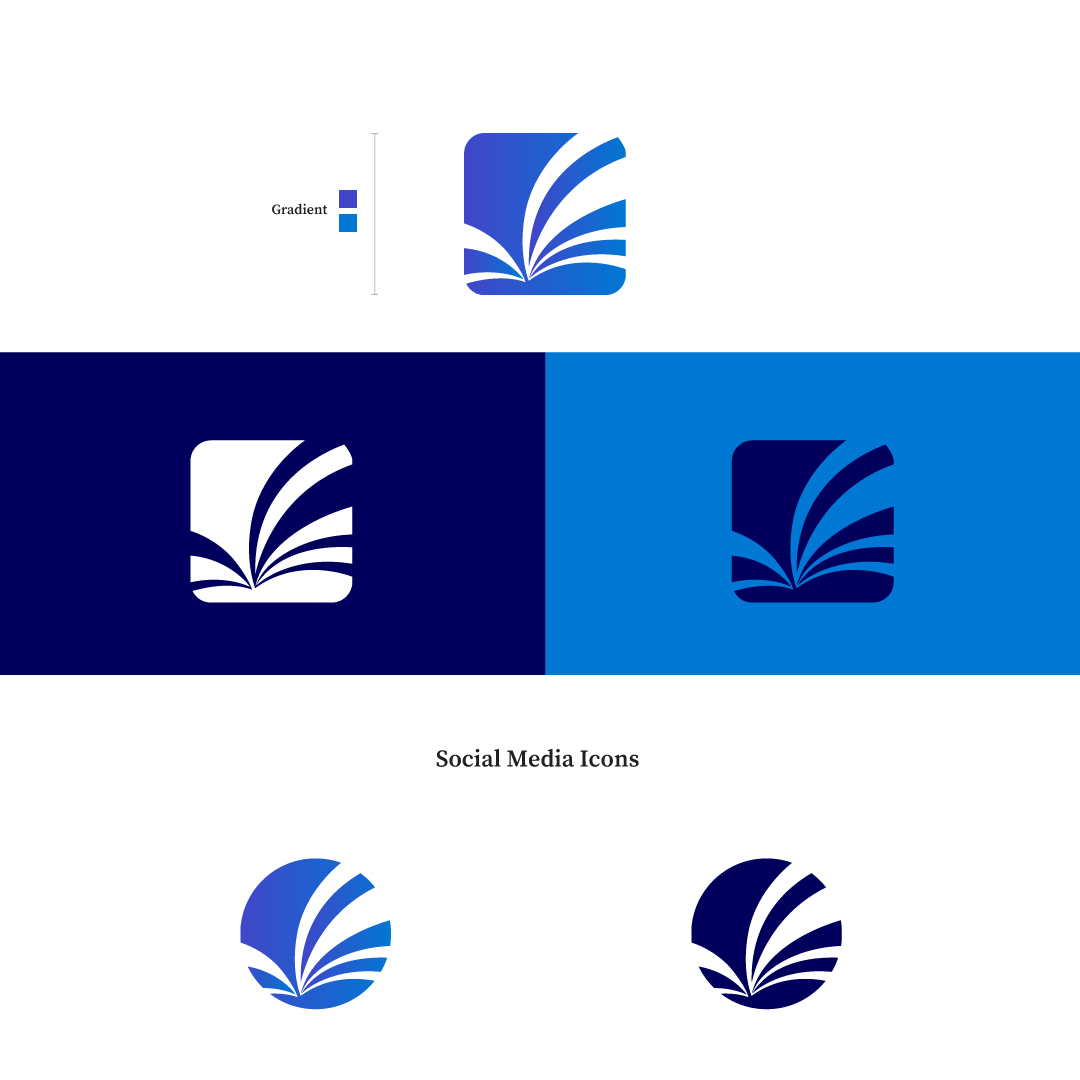
Alternate Logos
Social Media Graphics
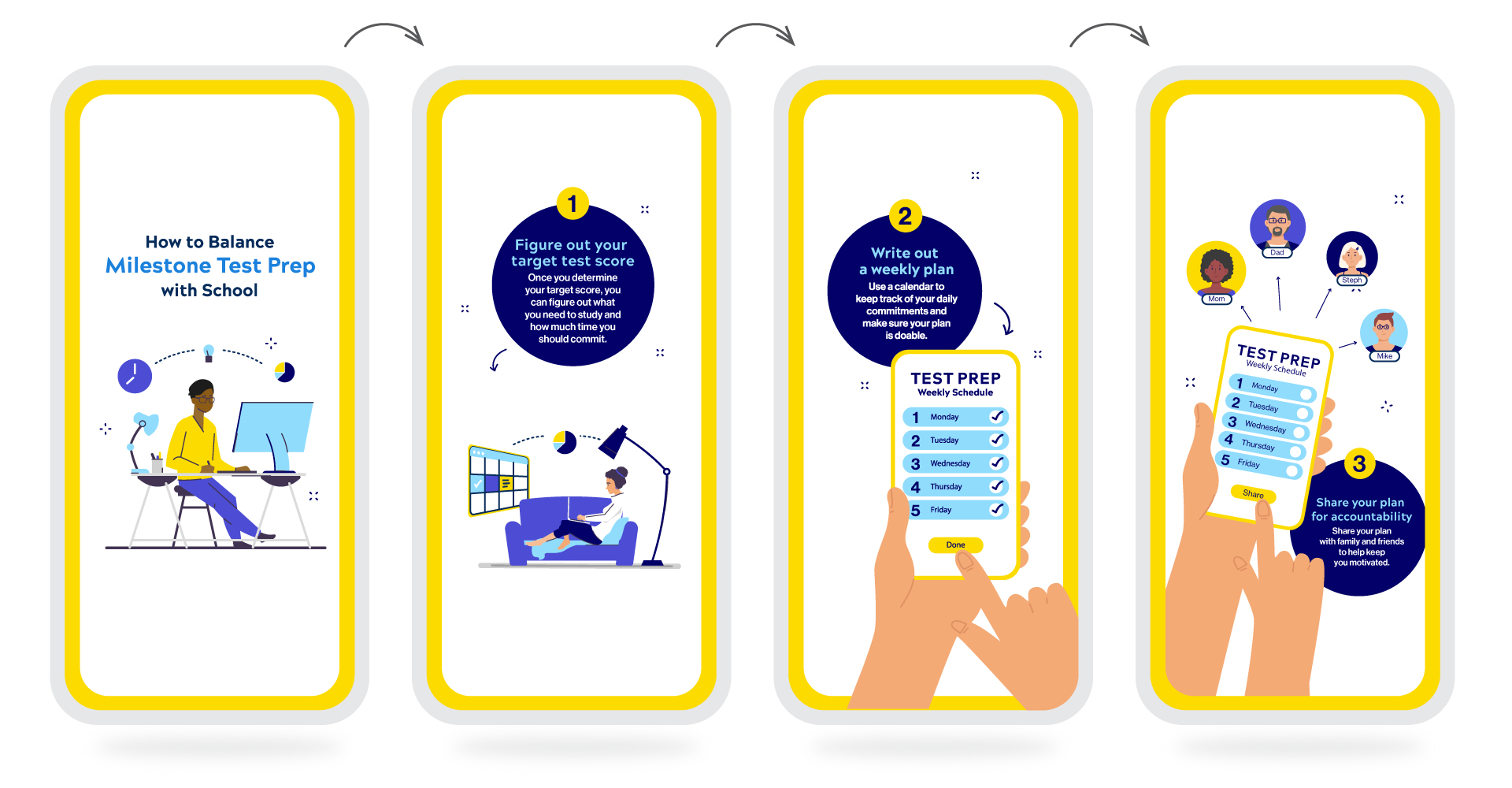
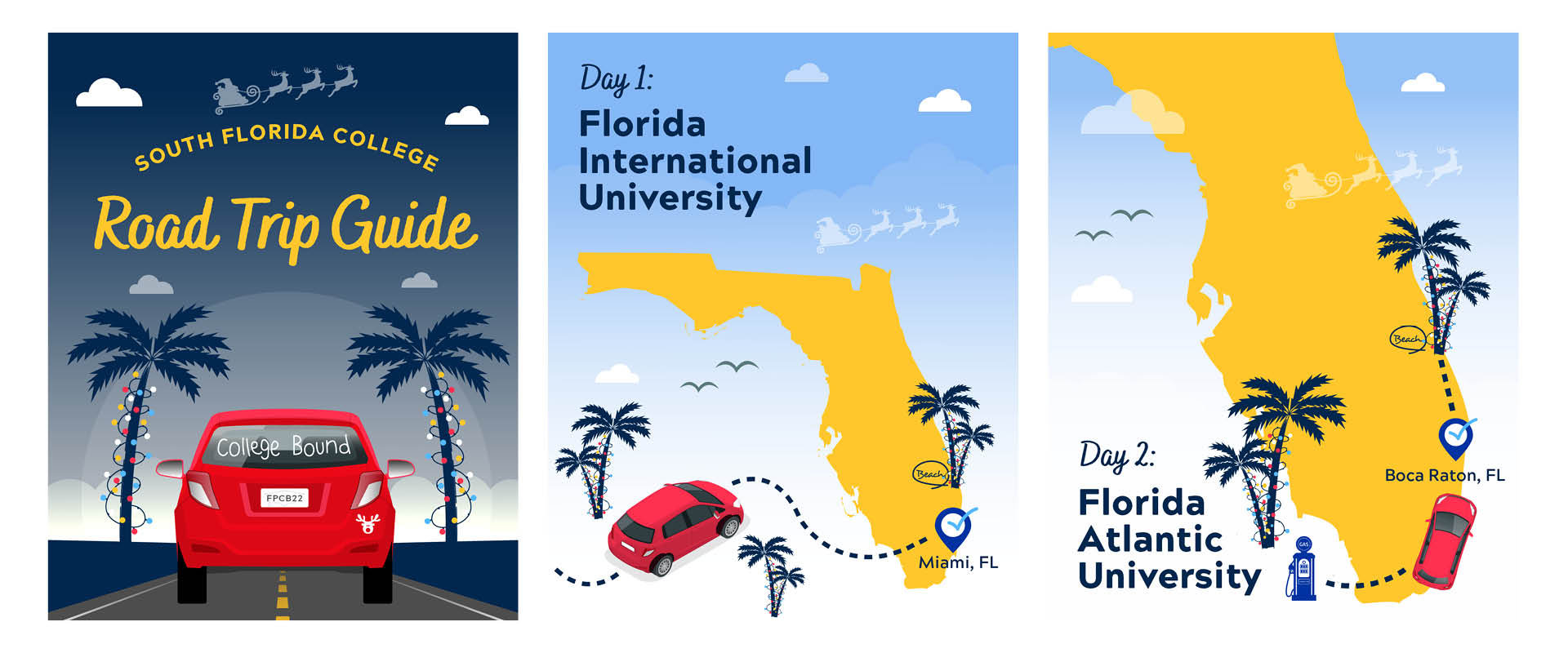
The brand focuses its message on educating the audience about saving for college and how signing up for a plan can help you save money by locking in rates. As a graphic designer in the studio team, I was able to self art direct the projects assigned to me and communicate with the social media and marketing team to ensure that not only their expectations were met but also those of the client. Getting the associate director to approve all aspects of each design was crucial to ensure the brand stayed consistent. Here is a collection of my favorite infographics and animated solutions that have been used across multiple platforms.

Stories Infographic
Social Media Carousel Post
Holidays Stories Ads
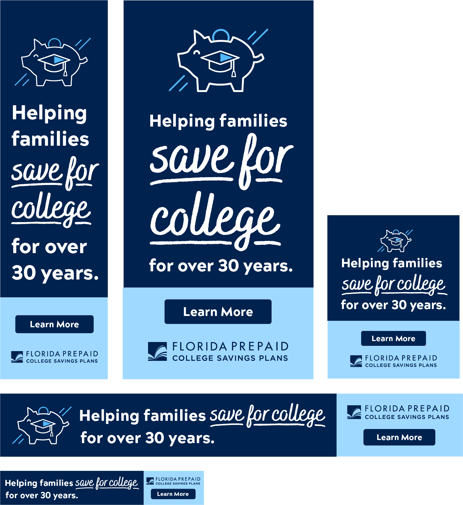
Digital Ads
The brand focuses its message on educating the audience about saving for college and how signing up for a plan can help you save money by locking in rates. As a graphic designer in the studio team, I was able to self art direct the projects assigned to me and communicate with the social media and marketing team to ensure that not only their expectations were met but also those of the client. Getting the associate director to approve all aspects of each design was crucial to ensure the brand stayed consistent. Here is a collection of my favorite infographics and animated solutions that have been used across multiple platforms.